
What's new
Read the project's description to learn about adaptive icons in Android apps. Thank you.
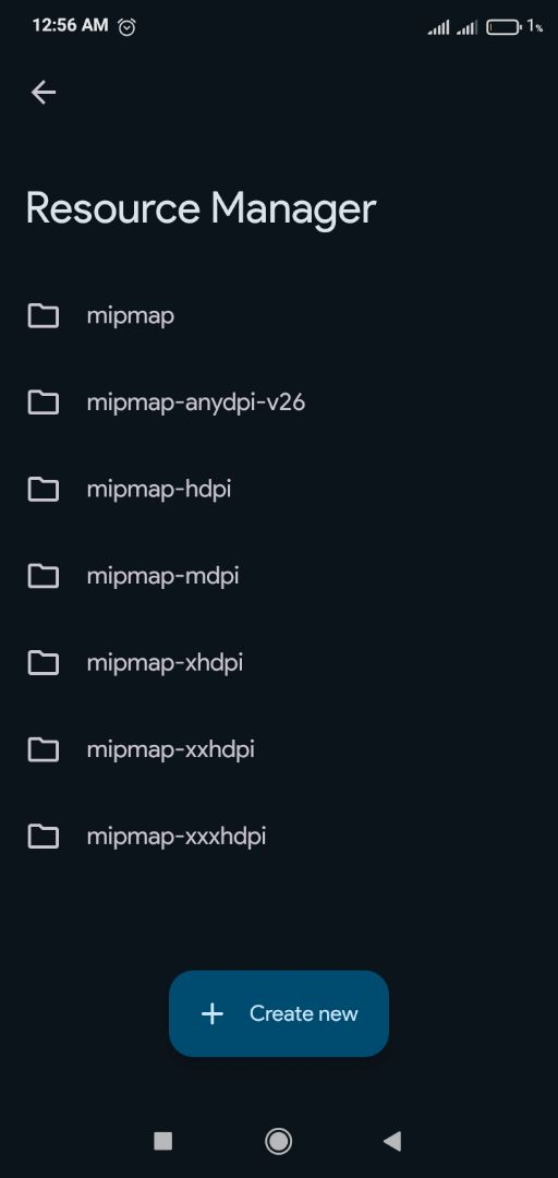
Screenshots
About
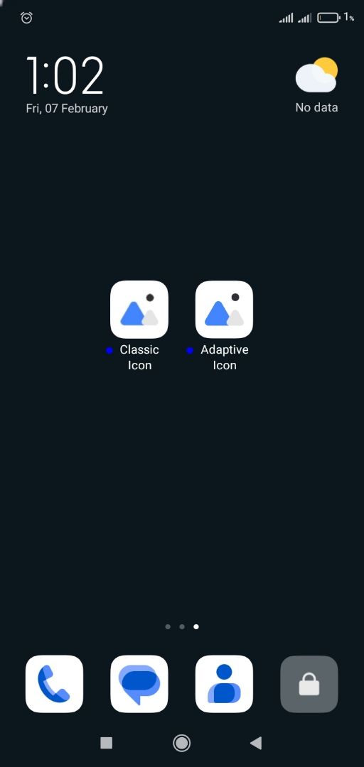
An Adaptive Icon is a type of app icon introduced in Android 8.0 (Oreo) that automatically adjusts its shape based on the device's launcher. It allows for a consistent look across different Android devices while supporting visual effects like animations and masking.
Key Features of Adaptive Icons:
Two Layers: Adaptive icons consist of a foreground and a background layer, allowing smooth animations.
Dynamic Shapes: The system applies different shapes (circle, square, teardrop, etc.) based on the launcher or device theme.
Scalability: Ensures the icon looks good on various screen sizes and resolutions.
The recommended size for an app icon depends on the platform:
Android
For Android, the adaptive and legacy launcher icons follow these sizes:
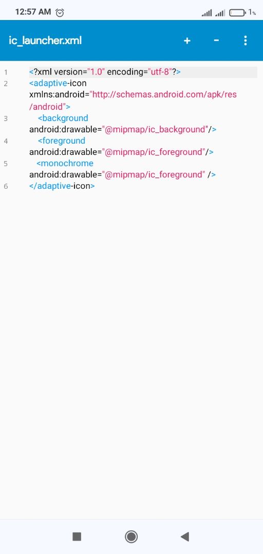
Adaptive Icons (Android 8.0+):
Foreground & Background Layers: 108 x 108 dp (432 x 432 px at 4x)
Final Rendered Icon: 48 x 48 dp (192 x 192 px at 4x)
Legacy Icons (Pre-Android 8.0):
MDPI: 48 x 48 px
HDPI: 72 x 72 px
XHDPI: 96 x 96 px
XXHDPI: 144 x 144 px
XXXHDPI: 192 x 192 px
Google Play Store Icon: 512 x 512 px
General Recommendation
For best results, design your app icon at 1024 x 1024 px, then scale it down as needed. Keep important elements within the safe area of 864 x 864 px to prevent cropping on adaptive icons.
Note : Monochrome icons were introduced in Android 13 (API 33) to support themed icons in Material You.
©2026 Sketchub | User Policy